Search This Blog

Pages

Copyright

All artwork and text is copyrighted by Frederick Gardner, unless otherwise attributed to the respective copyright owner, it is illegal to publish or print any such artwork or text without written permission by the artist or copyright owners.

Friday, September 11, 2015

Book of Life - "El Matador" Posters

I began working on Book of Life in June, 2010, back when the title was "El Matador". My first assignment from the writer/director, Jorge Gutierrez, was to design movie posters to help pitch the film to prospective distribution partners. 

I didn't know much about the original story (at that time) except that it involved the life and death of a matador, Manolo and his love for his childhood friend, Maria. The story was similar to Romeo and Juliet, but continued beyond Shakespeare's tragedy. The idea of love from beyond the grave inspired the following images...

"El Matador" Poster Concept 1

This poster design (Concept 1) was the first image I had in my head. It depicts Manolo in a traditional matador pose surrounded by victory roses in a pool of light, and skulls in the shadows. The source of the "light" is a portrait of Maria, shown as a window to the living world. Manolo is a skeleton. Manolo's bullfighting victory is bittersweet. This is my favorite of the designs I had done because it concisely portrays the story in a simple image. 

"El Matador" Poster Concept 2

"El Matador" Poster Concept 2 (Sepia)

This concept was inspired by the balcony scene in Romeo & Juliet and some of the posters for West Side Story. There are more concepts illustrated here, from the pool of light with the victory roses to Maria being the source of "light". The difference here is the roses are at the bottom of a grave and Maria is seen reaching into the same. The graveyard is seen behind Maria. Calavera skulls are shown in the shadows and ancestral bones are layered in the walls. The roots from the ceiling share the shape language of Maria's hair and are shown sprouting tiny hearts (a symbol of hope).
"El Matador" Tattoo Poster Concept 3

"El Matador" Poster Concept 4

"El Matador" Sacred Heart Poster Concept 5

"El Matador" Sacred Heart Poster Concept 5 (Sepia)

This is another favorite. The concept of the bull skull resembling the "sacred heart" (a popular Mexican symbol) came together nicely. The one image telling different sides of the same story was exactly what I was looking for. 

Sacred Heart of Jesus


None of these images went beyond my concept stage. Here is the final release poster and teaser for comparison...

BOL Teaser Poster

BOL "Sacred Heart" Logo
BOL Release Poster

Here are some inspired "fan made" posters for "The Book of Life":


Thursday, September 10, 2015

Car Fox Den

Here is an early concept for a redesign of the Car Fox den. The drawing suggests the "den" is not too far underground (due to the low hanging roots) and perhaps "Car Fox" has been stealing computer equipment and internet from the neighborhood to operate his data center. The spiral staircase and circular design are a nod to SPECTRE and the early Bond films.

Car Fox Den

Time Vehicles

In 2014, I designed a "Time Vehicle" for a museum interactive installation. The vehicle would be built as a motion control ride in a 360 degree projection environment. Having worked on a few 'time travel" projects in the past, I chose to focus on realistic details and authenticity. My drawings were influenced by deep ocean submersibles and the pods from 2001: A Space Odyssey. 


DNA Poster Designs

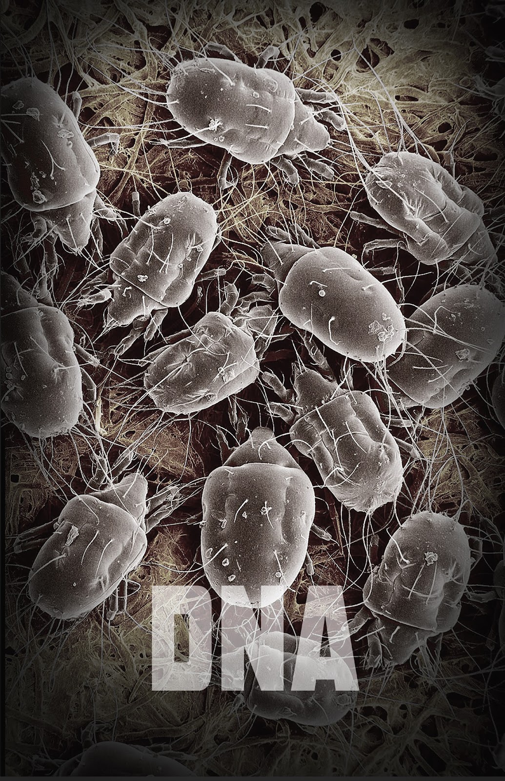
In Feb 2014, I was asked to design a poster for a Sci-Fi (live action) Thriller in development called, DNA. With only a brief synopsis and a lot of imagination, I did some quick comps. I started in the entertainment industry in 1988 working as an Ass't Field Publicist for Warner Bros Publicity. My first assignment was Tim Burton's Batman! I designed posters, standees, mobiles, buttons, cards, etc for many of Warner Bros releases for the next year and a half. I learned a lot from that experience and Warner Bros Publicity was the best in the business. 


Getting someone's attention from across a crowded room was key. I used that same logic for this design assignment. I wanted these poster to stand out from the other posters in a lobby. A good thriller should ask more questions than it answered, I think the poster should do the same. 


The previous is one of my favorite designs from the series. It portrays a nanobot/skin mite in an "x-ray" macro view. The composition suggests the mite is some strange alien in an environment suit.


The simplicity of the composition adds to the shock value. It's easy to read and the images stays with you after. 


Color palettes were kept to a minimum and I tried to create a "second read" to reward the viewer for taking a step closer. I think most great paintings do the same thing. 


In this series of designs, I really tried to push a "Matrix" look for the nanobots. It doesn't take much to cross a machine and an insect and the combination with additional wires for hair adds to the creepiness.


Being a huge fan of the horror and sci-fi genres, I chose shocking images and colors that would grab my attention and make me ask for more. I was inspired by the imagery of David Fincher and David Cronenberg and used the themes of technology, medical research and death for the project.

Friday, August 14, 2015

The Pilgrim Fortress???

The revised script had the pilgrims living in a fortress at Plymouth! 

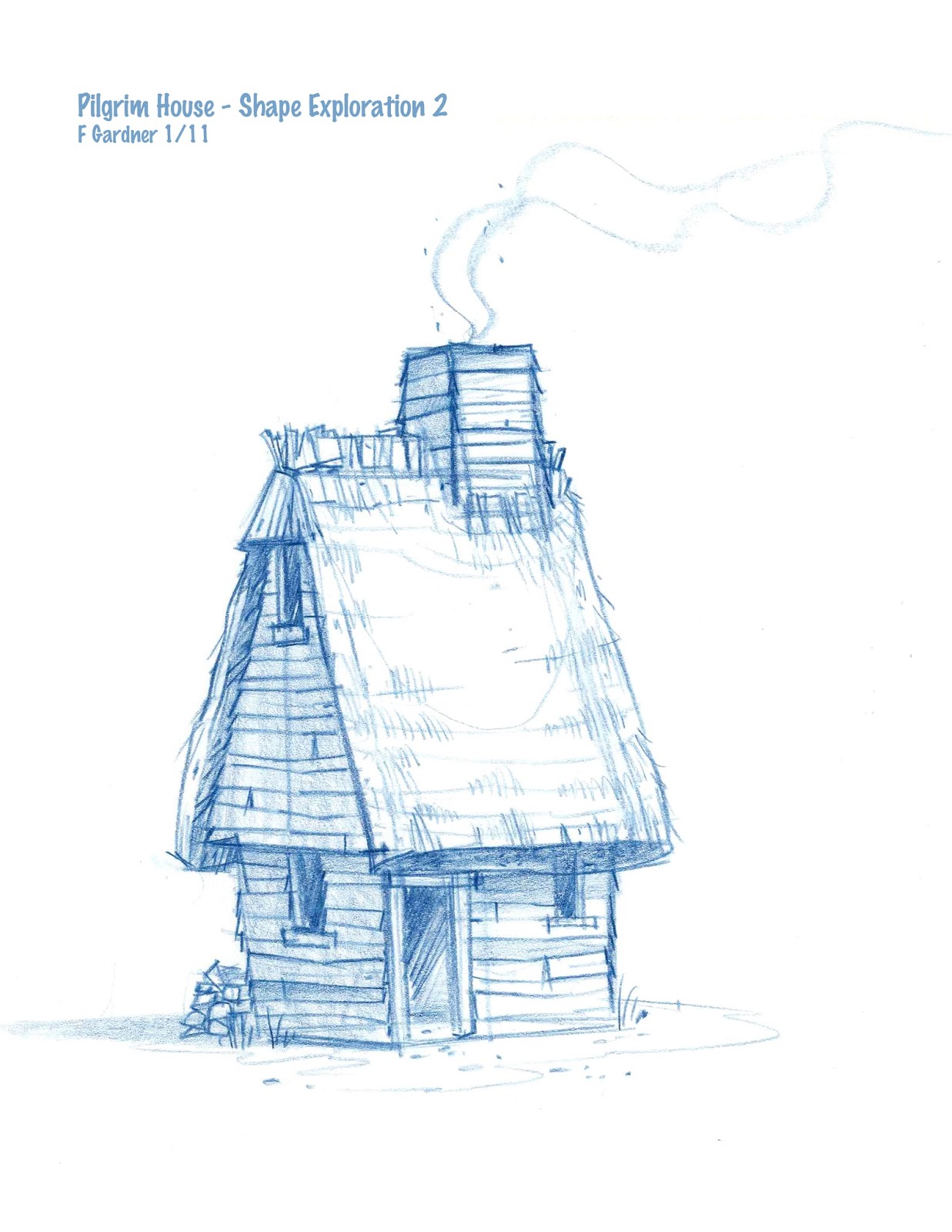
I tried to keep the new designs simple and historically accurate to the period. I pursued a "rustic elegance" in the look to contrast with the life the turkeys were living in their underground village. These designs were deemed "too cartoony" and we moved in a realistic direction. 


Strong silhouettes were key to bringing "character" to the puritan architecture and furniture in the beginning. Soon, the look would be revised and lean toward the hyper-real.


Friday, August 7, 2015

Puritans & Indians

One of the first things I did when I started designing "Time Turkeys" is ask my friend CS to take a pass at the cast of characters. He did a series of drawings that really raised the bar on the overall look of the film. His designs have a wonderful 50s Disney look to them and they definitely fit the irreverent tone of the film. 

Rough size/Shape Language Study - CS

Secondary Characters - "TIme Turkeys"


The scientists and humans were threatening. I saw the pilgrims as analogous to "starving rats' and the Indians should be shown to live in harmony with their surroundings and the turkeys. CS did exactly that and more!

Theoretical Physicist #1

Theoretical Physicist #2

Mission Scientist


I really loved the designs for the pilgrims. Really pushing their characteristics to resemble sick rats was fitting as they lived in the salvaged remains of the Mayflower. 

Pilgrim Design & CG Model


Indian Chief w/ Breastplate

Indian Chief

"Turkey Poop" War Paint

Indian Brave (w/ Turkey Feather)
 
Indian Squaw w/ Medicine Stick
This styling did not last long and was revised to a completely different direction.